The purpose of this assignment was to create a pop- art photogrpahy piece. I had to use photoshop to edit my images. I had to take photos of items that tells them what I lie and what I don't like.
The images that inspired me was images from Roy Lichtenstein and Andy Warhol. I don't have a particular image that inspired me from my research. Pop- art came about to use in comic books. This was to show how pop- art was used. It was used for comic books to show the brightness and the pop- art techniques. The artists that I researched was Roy Lichtentein and Andy Warhol.
The ideas that I had was to create more than one pop- art image to show my techniques. Also this was to show how I created a pop- art image/piece of artwork using photoshop. The thing that I intended to produce was a pop- art image or two to show my interests.
I managed my time effectively because I took my time with doing my final piece. I didn't rush it because I wanted to make the best quality of my photos. The considerations that I had to take into account whilst I did this project was to make sure that photoshop didn't freeze on me. This was kind of annoying at times. Also I had to take into account that not all of my photos was the correct settings when I was taking the photos.
My photography did match my proposal. This is because I followed it to the best of my ability. I made sure that my photography used the correct settings that I did in my propsal. This is because I wanted to follow my proposal exactly.
The things that I had to take into account was the lighting setting. I had to make suretthat the lighting was to the best it should. I had to double check that there was no shadows whilst I took my photos. Also I had to take into account the ISO. This was because I wanted to make sure that the ISO was the same throughout my photoshoot to get the bets quality photos.
The photoshop skills that I used was to be able to create the pop- art using this software. Also another skill that I employed was learning how to edit a photo to a pop- art style. These were used to enhance the shots that I prodcued by changing the colour of the background of each photo to turn it into a pop art image.
My photography did effectively meet the requirements of my proposal and the brief. This is because I followed them carefully. Also my final pieces looked like pop- art images showing that it met the requirements of the overall brief and from my the proposal. I think that my final pieces are fit for purpose because I have used my time to create them. Also I ahve made them look like someone has drawn them and I have effectively used my photogrpahy skills.
If I was to do this project again the only thign that I feel I would chnage and do differently is use some different items. This would create a different pop- art image. Also I would only create one final piece to save some time and to save some work. I have learnt from this assignment how to create a pop- art image using photogrpahy and photoshop. Also I have learnt that editing pop- art images aren;t as easy as they are supposed to be. This is ecause of the hue and saturation that didn;t particularly change the object's colour each time I duplicated it.
Friday, 1 April 2016
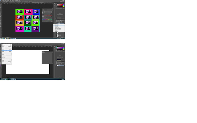
Screen Shots of editing techniques
The editing techniques that you use to create a simple pop- art piece is to use Photoshop. The first step of this is to open up the photo that you would like to turn into a pop- art image. If the image is on a white background then it is slightly better to edit and take out compared to a general background with things inside it. The second step is to change the exposure and the levels. To do this you click on image then choose levels and exposure one at a time to change the settings. The best setting is where the image is bright and clear but not by too much incase you spoil the original photo. The third step is to use the pen tool which is located on the left hand side also known as the toolbar. This cuts around the image without getting the background in the image. The next step is to make selection once you have selected around the image. Then you need to choose the 3 pixels otherwise your image won't move where you want it.
The fourth step is to add your image onto a new document using the measurements of 420 by(x) 594 and 30 resolution for the correct size for your final pop- art image. You might need to add another new layer for this to work. Then you need to flatten the image on the layers or the image background won't work/turn out well- the way that you want it to. The fifth step is to change the background to any colour you want. You do this by clicking on the paint bucket tool which is located and found on the toolbar. Then you need to change the hue and saturation. To do this you click on the icon at the bottom right hand side of the page where the layers are. It is located right near the bin and layer mask. The sixth step is to duplicate the layer. To do this you click on the layer that should be highlighted. Then you right click and click duplicate layer. This will give you another layer exactly the same as your previous layer, except it will put the new layer on the old layer. Then you need to drag your new layer next to your old layer.
Next you just change the background colour to something bright. This will give you a pop- art image. Then you repeat the process multiply times until you end up with a page of pop- art images. The last steps is to flatten the image which is mainly located along the layers. You just need to click on a layer and it should come up with flatten image. If it doesn't you just need to click on layer and flatten image. Then you just need to save your work to a hard drive or memory stick.

Subscribe to:
Comments (Atom)


