Extra Pop- Art research
From my knowledge the colour to always start off with when creating a pop- art piece from hand is the brightest colour first. This would include using the colour yellow first to stop any smudges. Pop- Art has mainly been used for Mickey Mouse and comic books from Roy Lichtenstein to show his style.

1. I like this image because it captures the effect of the spray can spraying everywhere. The image shows all of the elements to pop- art which I like. The bright colours used for the image shows the brightness, also it stands out from the rest of the image, The black outline gives the likeness to show it is a piece of art, instead of a realistic image. (Roy Lichtenstein)

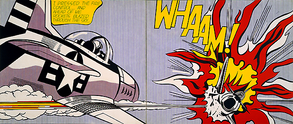
2. I like this image because it gives the indication of a comic book
or strip style. It shows that action has just happened with the way the explosion has been drawn. I also like this image because it gives the feeling that an explosion has happened. The black outline highlights the boldness, It captures the slight realism of the image. (Roy Lichtenstein)
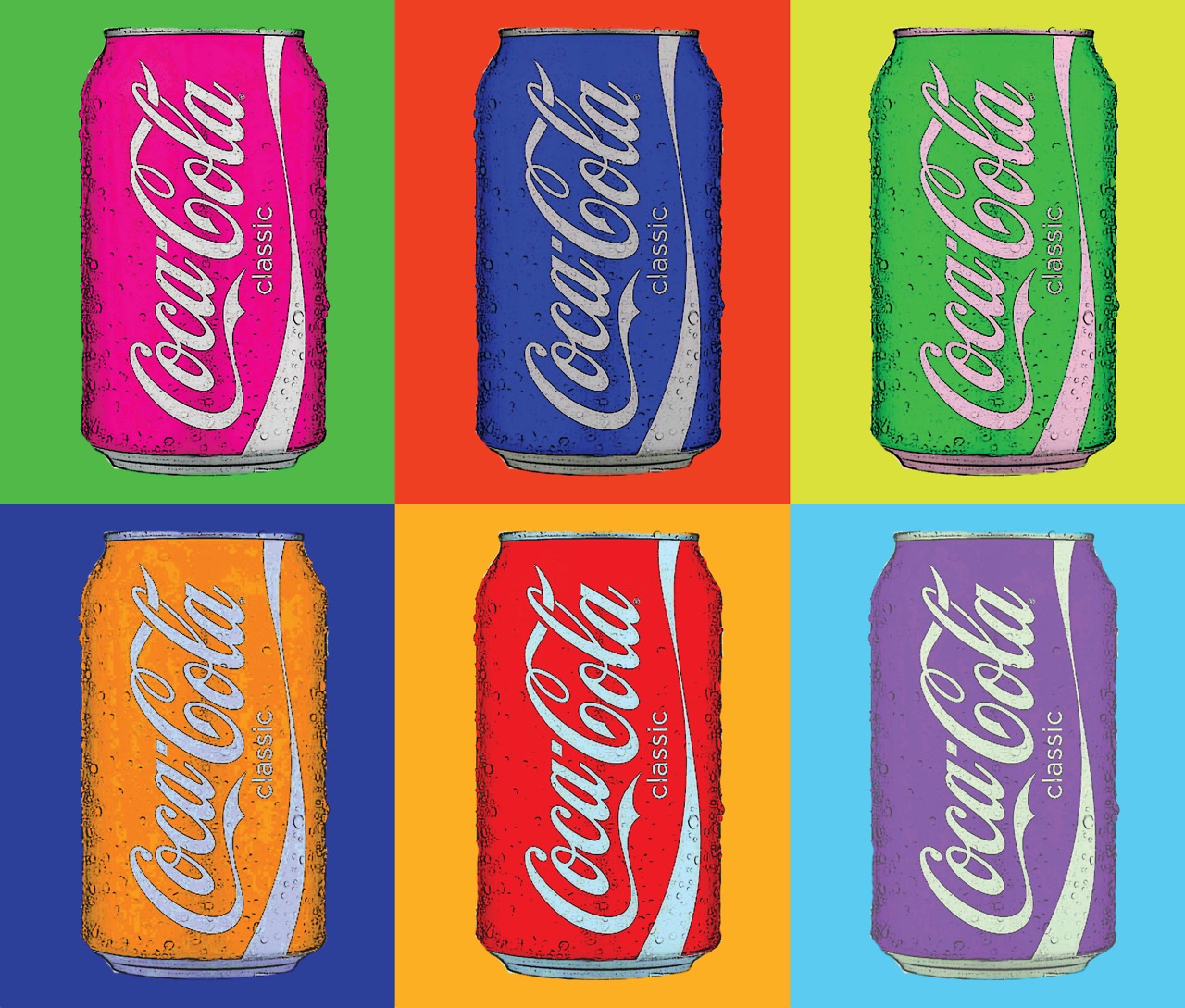
3. I like this image because it looks like a cartoon. The fact that the artist has used a different colour background for each of the coke cans makes it stand out. I like the fact that photography has been used to create this piece of pop- art which I like. It shows that different styles of pop- art can be used with photography aswell as drawing art. (Andy Warhol)
.

4. I like this image because it shows the fish swimming in the fish bowl. It gives the impression that the fish don't want to be in the fish bowl. I also like this image because of the way that the water has been created. I like the fact that Benday Dots has been used to create the water effect. This makes the image stand out as it looks like the fish are swimming in the water. (Roy Lichtenstein)
 5. I like this image because it shows another cartoon style. I like the fact that not all of the objects in this photo has been coloured in. It gives the carton effect without using colour. Also I like this image because it makes me feel as though I am in the image. (Roy Lichtenstein)

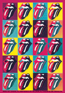

8. I like this image because it shows the different colours used for one object. I like the fact that the photography pop- art stands out from the rest of the image. I like the fact that the colours repeats itself to show the pop- art style. (Andy Warhol)
9. I like this image because it captures Marilyn Monroe perfectly. The way that Marilyn Monroe has been used to create this pop art style is fantastic. I like the fact that the artist has captured different people also to use as a pop art image. It makes the pop art style more interesting. (Andy Warhol)
10. I like this image because it captures the pop art style in a comic book. The way that he pop- art looks as though it is leaping out the place grabs my attention. I like the colours that has been used to create the image. It stands out form the page. (Roy Lichtenstein)
Contact sheet:

Seamless Background
 The equipment that I will need to make my pop- art studio/seamless back-drop is to have:
A camera to capture all of the lighting that I need( low IS0 to capture the right lighting)
A tripod to make sure that my camera doesn't move
A red head to get rid of any shadows that isn't needed.
An object or two to capture/take with, to use for my project
No comments:
Post a Comment