The purpose of this assignment was to create a pop- art photogrpahy piece. I had to use photoshop to edit my images. I had to take photos of items that tells them what I lie and what I don't like.
The images that inspired me was images from Roy Lichtenstein and Andy Warhol. I don't have a particular image that inspired me from my research. Pop- art came about to use in comic books. This was to show how pop- art was used. It was used for comic books to show the brightness and the pop- art techniques. The artists that I researched was Roy Lichtentein and Andy Warhol.
The ideas that I had was to create more than one pop- art image to show my techniques. Also this was to show how I created a pop- art image/piece of artwork using photoshop. The thing that I intended to produce was a pop- art image or two to show my interests.
I managed my time effectively because I took my time with doing my final piece. I didn't rush it because I wanted to make the best quality of my photos. The considerations that I had to take into account whilst I did this project was to make sure that photoshop didn't freeze on me. This was kind of annoying at times. Also I had to take into account that not all of my photos was the correct settings when I was taking the photos.
My photography did match my proposal. This is because I followed it to the best of my ability. I made sure that my photography used the correct settings that I did in my propsal. This is because I wanted to follow my proposal exactly.
The things that I had to take into account was the lighting setting. I had to make suretthat the lighting was to the best it should. I had to double check that there was no shadows whilst I took my photos. Also I had to take into account the ISO. This was because I wanted to make sure that the ISO was the same throughout my photoshoot to get the bets quality photos.
The photoshop skills that I used was to be able to create the pop- art using this software. Also another skill that I employed was learning how to edit a photo to a pop- art style. These were used to enhance the shots that I prodcued by changing the colour of the background of each photo to turn it into a pop art image.
My photography did effectively meet the requirements of my proposal and the brief. This is because I followed them carefully. Also my final pieces looked like pop- art images showing that it met the requirements of the overall brief and from my the proposal. I think that my final pieces are fit for purpose because I have used my time to create them. Also I ahve made them look like someone has drawn them and I have effectively used my photogrpahy skills.
If I was to do this project again the only thign that I feel I would chnage and do differently is use some different items. This would create a different pop- art image. Also I would only create one final piece to save some time and to save some work. I have learnt from this assignment how to create a pop- art image using photogrpahy and photoshop. Also I have learnt that editing pop- art images aren;t as easy as they are supposed to be. This is ecause of the hue and saturation that didn;t particularly change the object's colour each time I duplicated it.
Friday, 1 April 2016
Screen Shots of editing techniques
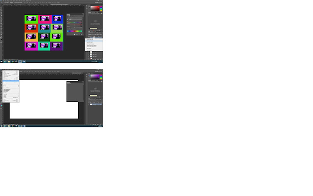
The editing techniques that you use to create a simple pop- art piece is to use Photoshop. The first step of this is to open up the photo that you would like to turn into a pop- art image. If the image is on a white background then it is slightly better to edit and take out compared to a general background with things inside it. The second step is to change the exposure and the levels. To do this you click on image then choose levels and exposure one at a time to change the settings. The best setting is where the image is bright and clear but not by too much incase you spoil the original photo. The third step is to use the pen tool which is located on the left hand side also known as the toolbar. This cuts around the image without getting the background in the image. The next step is to make selection once you have selected around the image. Then you need to choose the 3 pixels otherwise your image won't move where you want it.
The fourth step is to add your image onto a new document using the measurements of 420 by(x) 594 and 30 resolution for the correct size for your final pop- art image. You might need to add another new layer for this to work. Then you need to flatten the image on the layers or the image background won't work/turn out well- the way that you want it to. The fifth step is to change the background to any colour you want. You do this by clicking on the paint bucket tool which is located and found on the toolbar. Then you need to change the hue and saturation. To do this you click on the icon at the bottom right hand side of the page where the layers are. It is located right near the bin and layer mask. The sixth step is to duplicate the layer. To do this you click on the layer that should be highlighted. Then you right click and click duplicate layer. This will give you another layer exactly the same as your previous layer, except it will put the new layer on the old layer. Then you need to drag your new layer next to your old layer.
Next you just change the background colour to something bright. This will give you a pop- art image. Then you repeat the process multiply times until you end up with a page of pop- art images. The last steps is to flatten the image which is mainly located along the layers. You just need to click on a layer and it should come up with flatten image. If it doesn't you just need to click on layer and flatten image. Then you just need to save your work to a hard drive or memory stick.

Friday, 18 March 2016
Final Images
These are the final images of my Pop- Art that I have edited using Photoshop. I have created three pop- art final images as I didn't know how many to create in the first place. I like all three of my images because I have changed the backgrounds to make them good effective in pop- art.
Memory Check
Q1
– Detail two reasons why we change the ISO
The two reasons why we change the ISO whilst taking photos is so they don't blur. Also we change the ISO to make sure that we get the best quality of the image as possible without any smudges or light irritation. The lower the ISO the lower the quality of the image.
Q2
– Explain the difference in depth of field between a wide and a
narrow apature
Q3
– List four consideration your had to take into account when producing your
pop-art photography. For example, depth of field, shadows etc)
Q4. Describe when would you choose to use the ‘A’ and
the ‘P’ modes on a camera
I would choose the Apature-(A) mode on a camera when something is close like a flower or person, depth of field, wide apature affects the shutter speed. However you would use a Program mode on a camera when it lets you adjust the photo, also known as Flexible Program.
Wednesday, 16 March 2016
Extra Pop- Art research
From my knowledge the colour to always start off with when creating a pop- art piece from hand is the brightest colour first. This would include using the colour yellow first to stop any smudges. Pop- Art has mainly been used for Mickey Mouse and comic books from Roy Lichtenstein to show his style.
This images are my drawings that I created at home. I made them by using my art skills. I found this to be my own piece of work. This is my intital and own research that I have found useful and great to sue. This is because of the colours used. I have used a mesh that some sequences came from to create the Benday Dots.
This images are my drawings that I created at home. I made them by using my art skills. I found this to be my own piece of work. This is my intital and own research that I have found useful and great to sue. This is because of the colours used. I have used a mesh that some sequences came from to create the Benday Dots.
Monday, 14 March 2016
Pop Art Techniques
This photo shows how an ordinary image shows a pop- art image. This is shown by using a new layer with a different colour for the background. Without using different layers you can't create the pop- art style. This also makes the image look cartoon like which is kind of the effect of pop- art. This one from my research looks like the most simple one I have collected because it shows a simple photo of pop- art with the techniques used.
http://www.photoshopessentials.com/photo-effects/pop-art/- This link shows how an ordinary image becomes a pop- art image. It shows all of the techniques on how to create the perfect image which I like. It follows a step by step on how to create a pop- art image in simple steps.
I have had a little try at the moment and it hasn't worked as well.
This is what I have created so far to do with how to create a pop art image. At first my work didn't turn out well but now it looks more like the website. He looks like he is heading towards the death side due to the colour red to have a go at using the pop- art style. I kept having the trouble of having the two images mixed together to create one image without deleting. It was annoying me and getting on my nerves. I have struggled with the rest of how to create the pop-art image as I am not used to photo- shop. I will have to carry on in my lesson when I will know what I am doing as I don't from this website. This is because the words used are harder to read. This is my try out that I have tried with the photo of my dad. It hasn't turned out as the best that I have wanted it to.
Friday, 11 March 2016
Research Items to bring
The 8/10 items that I could bring to next weeks lesson to photograph in my pop- art studio is:
1 A smurf figure
2 Sketchbook/pencils,pens
3 Doctor Who figures
4 Headphones
5 Teddy
6 Nail Varnish
7 Camera
8 Drink
9 Pencil Case
10 Phone
I would like to bring most of these items into College to photograph because it shows what I like and what I don't like. Also it shows my interests compared to other people's interests. These are just a few of my ideas of what I could bring into College to photograph. I would only take in about 8 items into college to photograph as I don't want to loose any of the precious items. I feel like 8 items would be enough to use for my work. Also 8 of my bright items would work well as they would show up as a pop- art image. I have put on my list of items that I could bring a drink, pencil case and phone to photograph for my pop- art work. I don't think that I will use these items as I have enough items to photograph.
I would like to bring most of these items into College to photograph because it shows what I like and what I don't like. Also it shows my interests compared to other people's interests. These are just a few of my ideas of what I could bring into College to photograph. I would only take in about 8 items into college to photograph as I don't want to loose any of the precious items. I feel like 8 items would be enough to use for my work. Also 8 of my bright items would work well as they would show up as a pop- art image. I have put on my list of items that I could bring a drink, pencil case and phone to photograph for my pop- art work. I don't think that I will use these items as I have enough items to photograph.
Proposal
For my assignment I am going to create a pop- art type photography. To do this I am going to bring in 8 to 10 items that I would like to create. I will only use about 8 as I feel that is enough compared to using 10 items.
The items that I would like to bring in to photograph for this assignment is a smurf figure, some doctor who action figures, a pencil case, a camera,, a phone, a drink(Lucozade bottle), nail varnish, Sketchbook- pencils and pens, Headphones and a small Teddy. I won't bring in all 10 but just the main 8. I will bring in these images so that they show who I am through items instead of in words.
The camera settings that I will use when I am creating my pop- art is to have it on a low shutter speed with a low depth of field. I will take a lot of test shots to see which one works better out of all of them. The ISO that I will have whilst taking my photos is on a low setting to keep the quality of the photo. This would also stop the blurriness and decent photos.
I will also add all of my photos onto Photoshop to start editing them in the style of Pop- Art. This includes things like a bright colour background to add to the Pop- At theme, with different colours for the item to show it has been drawn/photographed. The lighting that I will use for my project is probably a light setting. This is to stop the shadows from messing up the image.
The photographic equipment that I will need is a tripod to keep the camera on- to stop it from falling off and breaking, a camera to take the photos. Without a camera you can't take photos. I will also need some objects for the camera t o take photos of, I will also need a red head to show the lighting better without having the annoying photos. Also for the lighting I will need a low lighting for a better quality photo.
Research- all in my own words
The time period of Pop Art was 1955 to about 1960s. The famous artists that use Pop- Art is Roy Lichtenstein and Andy Warhol. Pop Art has been used for photography. It has also been used for general art. Pop- Art has also been used for portraits of different people. This has been made into the style that the artist's see using simple lines and colours. The features of a pop- art image is Benday dots- which are used to create the dots of the image, bright colours to make the art work stand out clearly. Another feature of a pop- art image is that the colour black has often been used. This creates the style of a comic book as though the image is leaping from the page. The things that constitutes a pop- art image is the fact that it is often involved around Marilyn Monroe or bright colours. This is often duplicated to create a pop- art image. The background colour of each of the duplicates are different colours to give the image the brightness it needs. I think that pop-art images are created by using simple colours to make the image pop out form the page. Also I think that Benday dots are used to create the dots on the image instead of taking forever with ordinary dots. The way that the dots are created is simply by using a mesh without any sequences in to create neat and simple Benday dots. The black outline is simply used by using a black felt tip pen to highlight the outside of the Pop Art images. Also another way that a pop-art image is created is by taking a photo of another person with changing the background colour to create the pop- art style. The place that I feel a pop- art image should be used is in a comic book. This is because of the bright colours and boldness of each pop- art image. Also pop- art should be used for comic strips/books because of the fact that it looks like the image is moving. This is because pop- art is a modern movement piece of art making it look as though the image is moving. The product that could use a pop- art image in its advertising is a poster. This is because of the bright colours that the image uses. The equipment that I think I will need for this is a camera- with a low shadowed depth of field to create the pop- art type style. Also I think that I will need a tripod to keep the camera still, a red head to capture the type lighting of each of my shots.
Extra Pop- Art research
From my knowledge the colour to always start off with when creating a pop- art piece from hand is the brightest colour first. This would include using the colour yellow first to stop any smudges. Pop- Art has mainly been used for Mickey Mouse and comic books from Roy Lichtenstein to show his style.
1. I like this image because it captures the effect of the spray can spraying everywhere. The image shows all of the elements to pop- art which I like. The bright colours used for the image shows the brightness, also it stands out from the rest of the image, The black outline gives the likeness to show it is a piece of art, instead of a realistic image. (Roy Lichtenstein)
2. I like this image because it gives the indication of a comic book
or strip style. It shows that action has just happened with the way the explosion has been drawn. I also like this image because it gives the feeling that an explosion has happened. The black outline highlights the boldness, It captures the slight realism of the image. (Roy Lichtenstein)
3. I like this image because it looks like a cartoon. The fact that the artist has used a different colour background for each of the coke cans makes it stand out. I like the fact that photography has been used to create this piece of pop- art which I like. It shows that different styles of pop- art can be used with photography aswell as drawing art. (Andy Warhol)
.
4. I like this image because it shows the fish swimming in the fish bowl. It gives the impression that the fish don't want to be in the fish bowl. I also like this image because of the way that the water has been created. I like the fact that Benday Dots has been used to create the water effect. This makes the image stand out as it looks like the fish are swimming in the water. (Roy Lichtenstein)
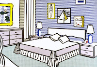 5. I like this image because it shows another cartoon style. I like the fact that not all of the objects in this photo has been coloured in. It gives the carton effect without using colour. Also I like this image because it makes me feel as though I am in the image. (Roy Lichtenstein)
6. I like this image because it Mickey Mouse looks as though he is walking off the piece of artwork. I also like the fact that Mickey Mouse stands out on the different coloured background because you can see him clearly. No complication parts on this photo have been sued which is why I like it. (Andy Warhol)
7. I like this image because it gives the indication to pop- art. I like the fact that this image uses just a simple photo but makes it into a pop- art style. I like the colours of the image because they don't class with each other, they stand out in a great way. (Andy Warhol)
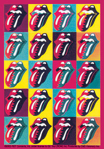
8. I like this image because it shows the different colours used for one object. I like the fact that the photography pop- art stands out from the rest of the image. I like the fact that the colours repeats itself to show the pop- art style. (Andy Warhol)
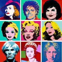
9. I like this image because it captures Marilyn Monroe perfectly. The way that Marilyn Monroe has been used to create this pop art style is fantastic. I like the fact that the artist has captured different people also to use as a pop art image. It makes the pop art style more interesting. (Andy Warhol)
10. I like this image because it captures the pop art style in a comic book. The way that he pop- art looks as though it is leaping out the place grabs my attention. I like the colours that has been used to create the image. It stands out form the page. (Roy Lichtenstein)
Contact sheet:
Seamless Background
Extra Pop- Art research
From my knowledge the colour to always start off with when creating a pop- art piece from hand is the brightest colour first. This would include using the colour yellow first to stop any smudges. Pop- Art has mainly been used for Mickey Mouse and comic books from Roy Lichtenstein to show his style.
1. I like this image because it captures the effect of the spray can spraying everywhere. The image shows all of the elements to pop- art which I like. The bright colours used for the image shows the brightness, also it stands out from the rest of the image, The black outline gives the likeness to show it is a piece of art, instead of a realistic image. (Roy Lichtenstein)
2. I like this image because it gives the indication of a comic book
or strip style. It shows that action has just happened with the way the explosion has been drawn. I also like this image because it gives the feeling that an explosion has happened. The black outline highlights the boldness, It captures the slight realism of the image. (Roy Lichtenstein)
3. I like this image because it looks like a cartoon. The fact that the artist has used a different colour background for each of the coke cans makes it stand out. I like the fact that photography has been used to create this piece of pop- art which I like. It shows that different styles of pop- art can be used with photography aswell as drawing art. (Andy Warhol)
.
4. I like this image because it shows the fish swimming in the fish bowl. It gives the impression that the fish don't want to be in the fish bowl. I also like this image because of the way that the water has been created. I like the fact that Benday Dots has been used to create the water effect. This makes the image stand out as it looks like the fish are swimming in the water. (Roy Lichtenstein)
 5. I like this image because it shows another cartoon style. I like the fact that not all of the objects in this photo has been coloured in. It gives the carton effect without using colour. Also I like this image because it makes me feel as though I am in the image. (Roy Lichtenstein)
6. I like this image because it Mickey Mouse looks as though he is walking off the piece of artwork. I also like the fact that Mickey Mouse stands out on the different coloured background because you can see him clearly. No complication parts on this photo have been sued which is why I like it. (Andy Warhol)
7. I like this image because it gives the indication to pop- art. I like the fact that this image uses just a simple photo but makes it into a pop- art style. I like the colours of the image because they don't class with each other, they stand out in a great way. (Andy Warhol)


8. I like this image because it shows the different colours used for one object. I like the fact that the photography pop- art stands out from the rest of the image. I like the fact that the colours repeats itself to show the pop- art style. (Andy Warhol)
9. I like this image because it captures Marilyn Monroe perfectly. The way that Marilyn Monroe has been used to create this pop art style is fantastic. I like the fact that the artist has captured different people also to use as a pop art image. It makes the pop art style more interesting. (Andy Warhol)
10. I like this image because it captures the pop art style in a comic book. The way that he pop- art looks as though it is leaping out the place grabs my attention. I like the colours that has been used to create the image. It stands out form the page. (Roy Lichtenstein)
Contact sheet:
Seamless Background
A camera to capture all of the lighting that I need( low IS0 to capture the right lighting)
A tripod to make sure that my camera doesn't move
A red head to get rid of any shadows that isn't needed.
An object or two to capture/take with, to use for my project
Subscribe to:
Comments (Atom)


